
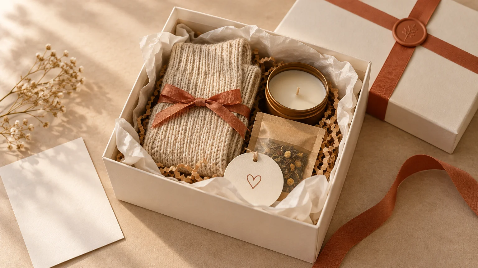
The quickest way to make a small gift box look professional is to give every detail a job. Choose a box that closely fits the contents, build a neat base, feature one item, support it with a few smaller pieces, and repeat a restrained color palette across the filler, card, label, and ribbon. The result should look composed rather than crammed.
You do not need expensive packaging or a box full of products. In fact, editing usually improves the presentation. A thoughtful three-item arrangement with a personal note can feel far more intentional than eight unrelated treats fighting for attention.
Start with a box that fits the gift
Lay out everything you intend to include before choosing the box. Group the items as they will sit, then look for a box that leaves enough room for protective filler without creating large empty areas. Purdue Extension’s Gift Wrapping Manual recommends fitting the box to the gift while allowing room for tissue or padding; an oversized box can let the contents slide, rattle, wrinkle, or break.
Depth matters as much as width. The lid should close without pressing on the tallest item, but the products should not disappear into a deep well of filler. Before decorating anything, perform a dry fit: arrange the contents, add a temporary layer of tissue, and set the lid in place without forcing it.
If the only box you have is slightly too deep, raise the presentation level with a firm, flat insert beneath the decorative filler. Do not rely on a mountain of loose paper to lift heavy objects; it compresses unevenly and can leave the arrangement looking sunken.
Choose one focal item
A polished box needs a visual starting point. Pick one item to be the feature, usually the largest, tallest, most colorful, or most meaningful piece. Place it toward the back or slightly off-center, then arrange shorter supporting items where they remain visible. Gift-basket presentation guidance similarly recommends establishing a focal item and using varied heights, sizes, and textures around it.
The focal item does not have to be the most expensive. It might be a mug printed with an inside joke, a small framed photograph, a jar of homemade treats, or a beautifully wrapped book. What matters is that the eye can find it immediately.
| Presentation problem | Why it looks unfinished | Simple correction |
|---|---|---|
| Everything is the same height | Items merge into one flat row | Raise the focal item and stagger the smaller pieces |
| The box looks crowded | Packaging and labels compete for attention | Remove one or two items and create visible breathing room |
| The contents look lost | The box is too large or the base is too low | Use a smaller box or add a firm insert beneath the filler |
| The colors feel random | Too many unrelated hues weaken the visual theme | Choose one main color, one supporting color, and a neutral |
| The lid will not sit flat | Tall items or excessive filler are pressing upward | Lower the base, reposition the tallest item, or change boxes |
Build the base in layers
Begin with a clean lining rather than dropping loose filler directly into the box. Fold tissue so it follows the shape of the base, allowing enough material to rise slightly along the sides. Purdue Extension notes that tissue can line the bottom and cover a gift, while crumpled tissue can help stabilize irregular shapes.
Next, add only enough shredded paper or crumpled tissue to cushion and elevate the contents. Flatten and shape it with your hands before placing the gifts. The goal is a controlled nest, not a cloud spilling over every edge.
Place the focal item first. Add the supporting pieces one at a time, turning attractive labels toward the recipient and hiding barcodes or retail stickers when practical. Keep delicate surfaces from rubbing together, and separate strongly scented products from food.
Once the arrangement works, tuck small amounts of filler into visible gaps. Avoid covering the products. Filler should support the composition quietly, much like a frame supports a picture.
Use color like an editor
A professional palette is usually limited rather than perfectly matched. Start with one main color connected to the occasion or recipient, add one supporting shade, and let white, cream, kraft, gray, or black serve as the neutral.
For example, a birthday box might use coral tissue, a peach label, cream filler, and a narrow coral ribbon. A client thank-you box could combine navy, warm white, and kraft. Repeating the same color two or three times makes separate materials feel like one set.
Pattern needs scale, too. Small boxes generally look cleaner with small prints or restrained motifs, while a large pattern can overwhelm the available surface. Both Purdue Extension and The Container Store recommend considering pattern size in relation to the box.
Add personalization without adding clutter
One personal cue can transform a tidy package into a gift that feels genuinely chosen. Use the recipient’s name, an important date, a private joke, or a tiny motif connected to something they love. Repeat that cue on no more than two elements—for example, the card and the package seal.
For one box, a handwritten tag may be all you need. For party favors, team gifts, or several matching packages, custom labels and package seals can create a repeatable finishing detail. Keep the design simple enough to read at the size in which it will actually be used.
Decide whether the message belongs outside or inside the box. A tag handles a short name or greeting; a card gives you room to explain why you selected the gift. The distinction is explored further in this guide to choosing between a personalized thank-you card and a gift tag.
If you want the entire presentation to share one visual motif, coordinate the gift, note, and seal rather than designing each piece separately. This matching gift, card, and sticker approach works especially well for birthdays, bridesmaid gifts, care packages, and small event favors.
Finish the exterior with restraint
Before closing the box, photograph the arrangement. The camera often reveals a crooked label, a hidden item, or an awkward gap that is easy to miss while working close to the project. Make the correction, add the card, and close the lid gently.
A lidded box may need only ribbon and a small seal. If you wrap it, sharpen the paper folds and hide adhesive where possible; The Container Store recommends double-sided tape to avoid visible tape. Match the ribbon width to the scale of the package rather than choosing the largest bow available. The guide to ribbon width for different gift box sizes can help you balance the final proportions.
Position the bow or label deliberately. Centered placement feels formal and symmetrical. An off-center ribbon or corner label feels more modern, but it should look clearly intentional—not as though it slipped while you were carrying the box.
A worked example: a small comfort box
Imagine a compact box containing a tea tin, a pair of cozy socks, and two wrapped cookies. The tea tin becomes the focal item at the back. The socks are rolled neatly and placed to one side, while the cookies sit in front where they remain visible.
Line the box with cream tissue and add a shallow layer of kraft paper filler. Use muted green as the repeated accent on the tea label, message card, and narrow ribbon. A short handwritten note—“For one quiet evening that belongs entirely to you”—supplies the personal reason behind the gift.
Nothing in that arrangement is complicated. It looks polished because the box fits, the heights vary, the palette repeats, and the message makes the selection feel specific to the recipient.
Check the box before presenting or mailing it
- The lid closes naturally without bulging or pressure.
- The focal item is visible as soon as the box opens.
- Shorter items are not hidden behind taller ones.
- The contents stay in position when the box is gently tilted.
- Barcodes, price stickers, and distracting retail packaging are removed or concealed where practical.
- The color palette is repeated consistently across a few details.
- The card or tag includes the recipient’s name and a specific message.
- The exterior has one clear finishing feature rather than several competing decorations.
If the gift will travel through the mail, treat the presentation box and shipping box as separate layers. Protect fragile objects individually and fill empty shipping space so the inner box cannot move. The USPS package-preparation guidance says contents and packing materials should fill the box and notes that parcels move through automated processing with other packages. A beautiful arrangement still needs practical protection around it.
Make one editing pass
Your final step is not adding another decoration. It is editing. Remove loose filler from labels, straighten the card, turn the most attractive surfaces forward, and ask whether anything competes with the focal item.
If you are building the box today, start by laying out the gifts and choosing the focal piece before touching the tissue or ribbon. Once that decision is made, the box size, arrangement, colors, and finishing details become much easier to control—and the finished gift will feel intentional from the first glance.